Blog
by Igor Gubaidulin
Designing for Persuasion, Emotion and Trust
The next loop of User Experience is about designing for persuasion, emotion, and trust. You still need good usability, but it’s often not enough to design a website that is easy to understand, navigate, and interact. Just because people can do something does not guarantee that they will – they must be motivated and persuaded to make decisions that lead to conversion. PET Design is rooted in social psychology and it’s pioneered by Human Factors Inc. It complements classic usability and user experience best practice. In this article by Igor Gubaidulin, he gives an overview of Design for Persuasion, Emotion and Trust (PET Design) and takes a look at some PET techniques in detail.

2006
Currently I’m working as an user experience architect at Nortal, but I started my career as a freelance graphic designer more than 12 years ago. Like many others, I created hundreds upon hundreds of web pages as a freelancer, but I have to admit I more often than not felt like a mere tool… a hammer in the client’s hands. They might have wanted me to blindly copy big brands, for example design an Audi or Chevrolet style site for a small auto dealer, even though the users of the site might have been looking for something else entirely. I wasn’t too happy about it.
So after a while I realized that by designing I would love to solve real problems, and that site’s or user interface’s design is nothing without the power of ease-of-use. So I began my journey in the usability world. And yay… I was happy. But… of course, there’s a but.
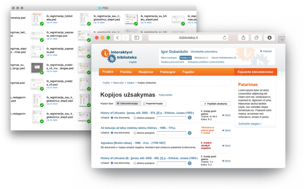
In the beginning of 2010, I was working with a team, which was creating a new service for the Lithuanian National Library. It was a superb and innovative service, which let everyone order electronic or paper copies of books and documents from public libraries anywhere in Lithuania.
2010
The team made a very detailed user analysis, provided comprehensive wireframes, created almost 200 different layouts in Photoshop, conducted usability testings… the service was excellent and it worked well. At the end of the project we were waiting for a big success, but… the service wasn’t as popular as we expected. We were baffled and wanted to know why. We found, by applying traditional usability techniques we can enhance efficiency, but just because people can do something does not guarantee that they will – they must be motivated and persuaded.
Usability is no longer enough
In short, usability stands for can do, but shouldn’t we be asking if they will do? For example, everyone can do sports, but does everyone do sports? (No.) We, as designers, must find a way to engage and persuade people to act.
We realized that usability was no longer enough. We had to step forward into the new world of user experience and emotional & persuasive design.
I started digging into social psychology and found that there are a lot of studies on engagement and persuasion. And it is not all that new.
Offline retailers had been using similar tools for years.

Photo: Lee Jin-Man
I found a lot good reads about it.
I wanted to find out more about this technique, so I kept digging and searching for something more.
PET Design™ toolkit
And accidently I found a wonderful PET Design™ toolkit by Human Factors International.
The toolkit was rooted in social psychology and consists of over 70 techniques for making user experiences more engaging, compelling, and effective. PET Design™ adds a layer of psychology to “gently nudge” potential customers towards your stated goal.

Now I’m going to take a look at PET Design™, but before I start, I would like to warn you: some concepts may sound cynical, manipulative or exploitative. And they could be used for evil purposes… (I’ll show you some of these later). Remember: it’s only a toolset. How you use it depends on you.
Alright, the PET Design™ toolkit is about designing for persuasion, emotion and trust.
- Trust techniques are for establishing credibility, providing assurances and removing risk.
- Emotion is a prime determinant of the sense of subjective well-being. Emotion-based techniques are about eliciting a desired emotional response during a process.
- And the last one – persuasion techniques – the triggers to an action. These techniques relate to the mechanics.
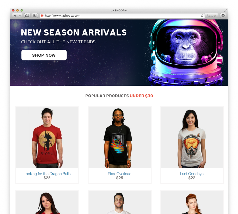
To illustrate the techniques, I downloaded free a PSD eCommerce website template from Pixelhint and added some graphics from Design by Humans. So it’s not a real shop.
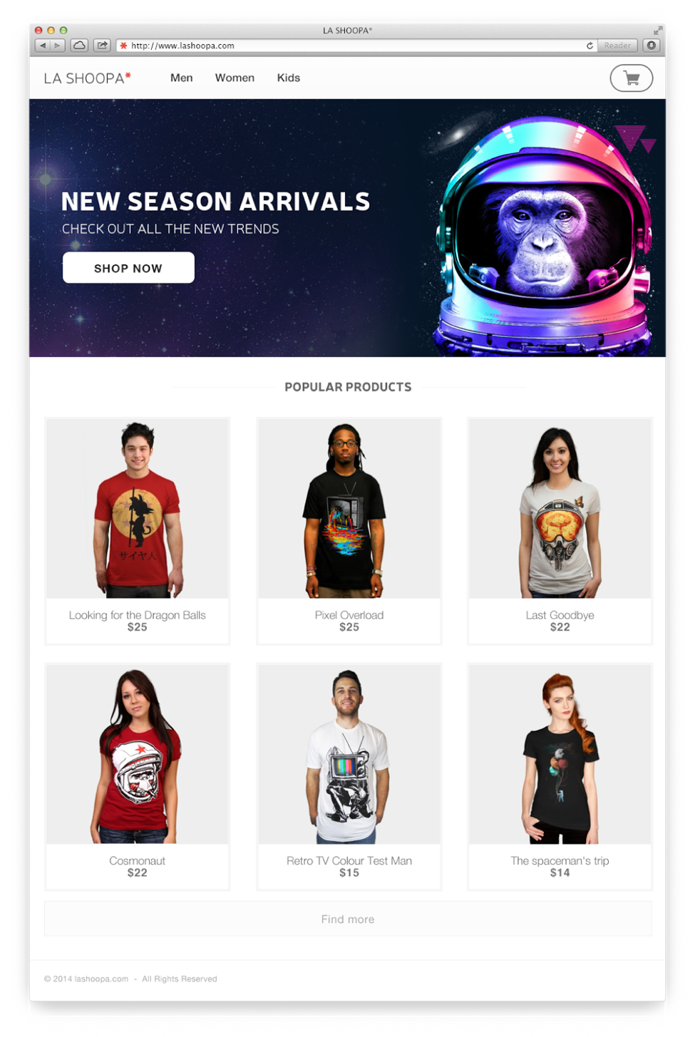
Let’s pretend we are the designers of La Shoopa e-shop, and we are selling t-shirts which are made by designers. Our goal is to sell more.
Honestly, there’s nothing wrong with this design. It’s perfectly good usability design, but we can make it much more persuasive by adding some additional details.
The toolkit says that we must address trust first. It’s what’s most essential. Trust is influenced by a combination of factors, which act as Trust Markers. There are 16 different trust markers:
- Credible Organization
- Domain Name
- Design Quality
- Match Existing Knowledge
- FAQ
- Citations
- Current Content
- Extensive Content
- Archives
- Links
- Physical Address
- Policies That Show Trust
- Certifications & Awards
- Testimonials
- Famous People & Common People
- Peer Advice and Service Comments
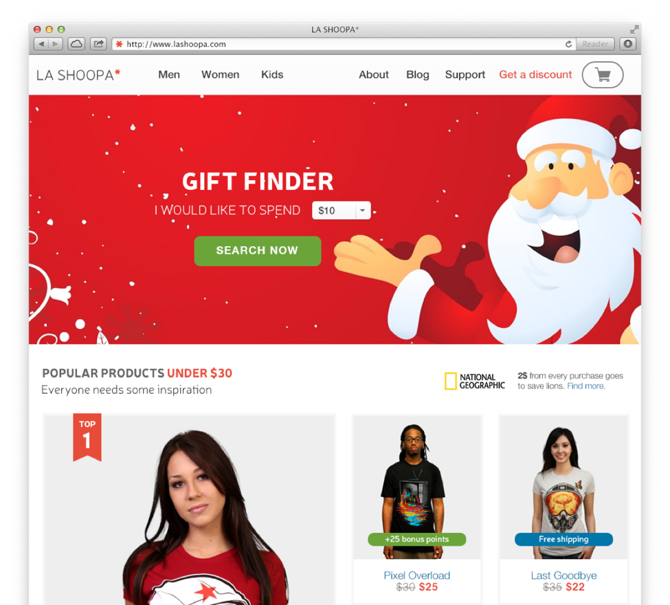
So I used those markers and tried to make La Shoopa better.
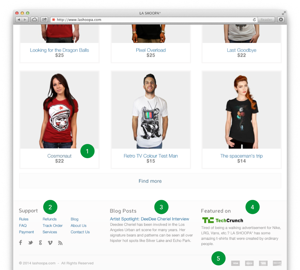
First of all, I changed the color of all the links. Everyone knows that links are usually blue. So I applied (1) the trust maker Match Existing Knowledge and changed each link’s color to blue.
Later, to enhance trust, I added the footer with some sections:
- Additional pages like Rules, Refunds, Track Order, Contact Us and trust markers like Policies that show trust, FAQ, Physical Address help to ensure users that you’re running a credible company and earn more trust from users.
- Usually the seller knows his products best. So don’t hesitate to show your knowledge and experience by providing Extensive Content.
- If someone has written about you, don’t be shy and let people know about it with Testimonials. If people trust TechCrunch, they will probably trust you.
- Certifications & Awards, even logos of Visa, MasterCard show credibility: if somebody has certified or awarded you, it implies that they know and trust you.
The situation was changed a bit for the better. I left some markers for you to think about after reading this article.
Optimal level of dissonance
We can use the Intrinsic Motivation technique – the optimal level of dissonance.
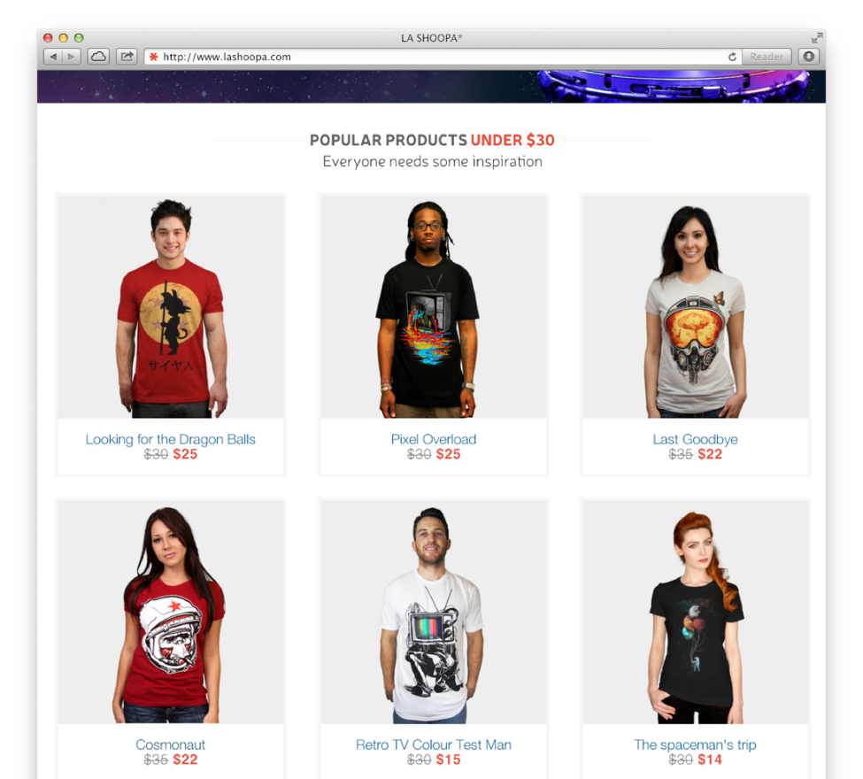
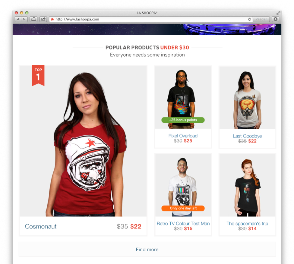
The optimal level of dissonance means that we should present something that seems a bit unusual, but not too unusual. For example, if a t-shirt made by a designer usually costs $50, we can draw the customer’s attention to the fact that our t-shirts cost under $30.
Reason for Request
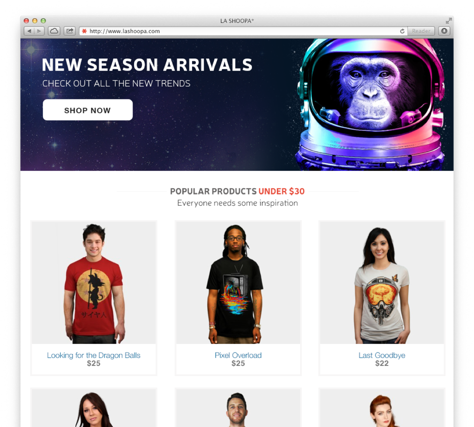
If you give people a reason for making a decision, they will also be more likely to make that decision. So I added a reason: Everyone needs some inspiration.
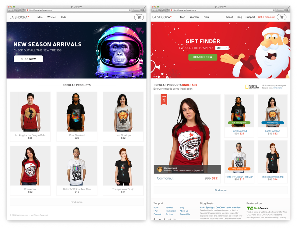
Contrast
One of the most powerful things we can do is help the customer see the value of something. We don’t have an internal value meter that tells us how much everything is worth, so we always evaluate things in comparison to other things.
Another thing about contrast: When scanning for visual information we are automatically drawn toward things that stand out. What do you want people to focus on? Let’s rearrange the blocks.
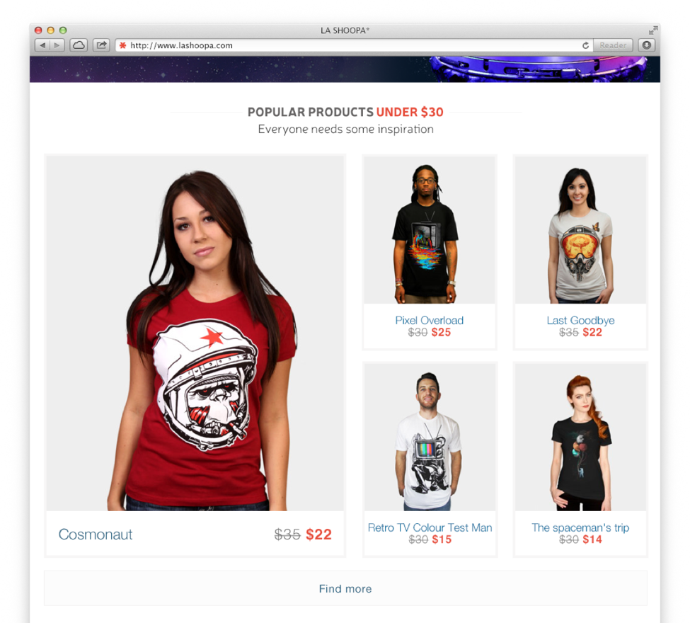
Let’s add even more contrast and use the power of Paradox of choice.
Freedom of choice is critical for us, but researches show that more choices lead to lower overall sales. We only think we want more choice, but we are confused by too many choices and then we might not make any decision at all. So let’s limit the choices. In this example I removed one t-shirt.
Good enough? No? Let’s move on then.
Social proof
People will do things that they see other people are doing. We assume that popular things are things that are worthwhile. So I added a badge: Top 1
Does the t-shirt really have to be the Top 1 shirt? As a designer I’ve seen many examples of fake social proof, e.g. items marked as popular, because there’s a stockpile of those unpopular items and they need to be sold. At some point one of your customers will notice that you are lying, and regaining trust is much harder than earning it in the first place.

Honestly, I love recommendations and they really work, even though I dislike pop-up windows, which cover the content.
Extrinsic reward
We can give people something that motivates them take action. For example, 25 bonus points.

Scarcity
People want what they may not be able to get in the future. We assign value to something that has limited availability or is promoted as being scarce. I added a label, which says: Only one day left.
WARNING: Overuse can devalue this technique.
The power of free things
One of the most powerful techniques available in the HFI toolkit is giving away a free product or service. Don’t you just love free stuff?

Feel Good + Argue against self-interest + Popular brand
If you give people a reason for making a decision, they will also be more likely to make that decision. If I buy t-shirt, it will help lions. Wow!
It’s an argument against self-interest and the popular brand of National Geographic helps a lot.
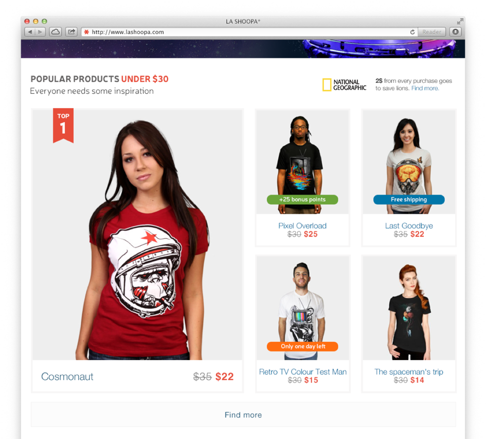
Disclaimer: All trademarks remain property of their respective holders, and are used only for educational purposes.
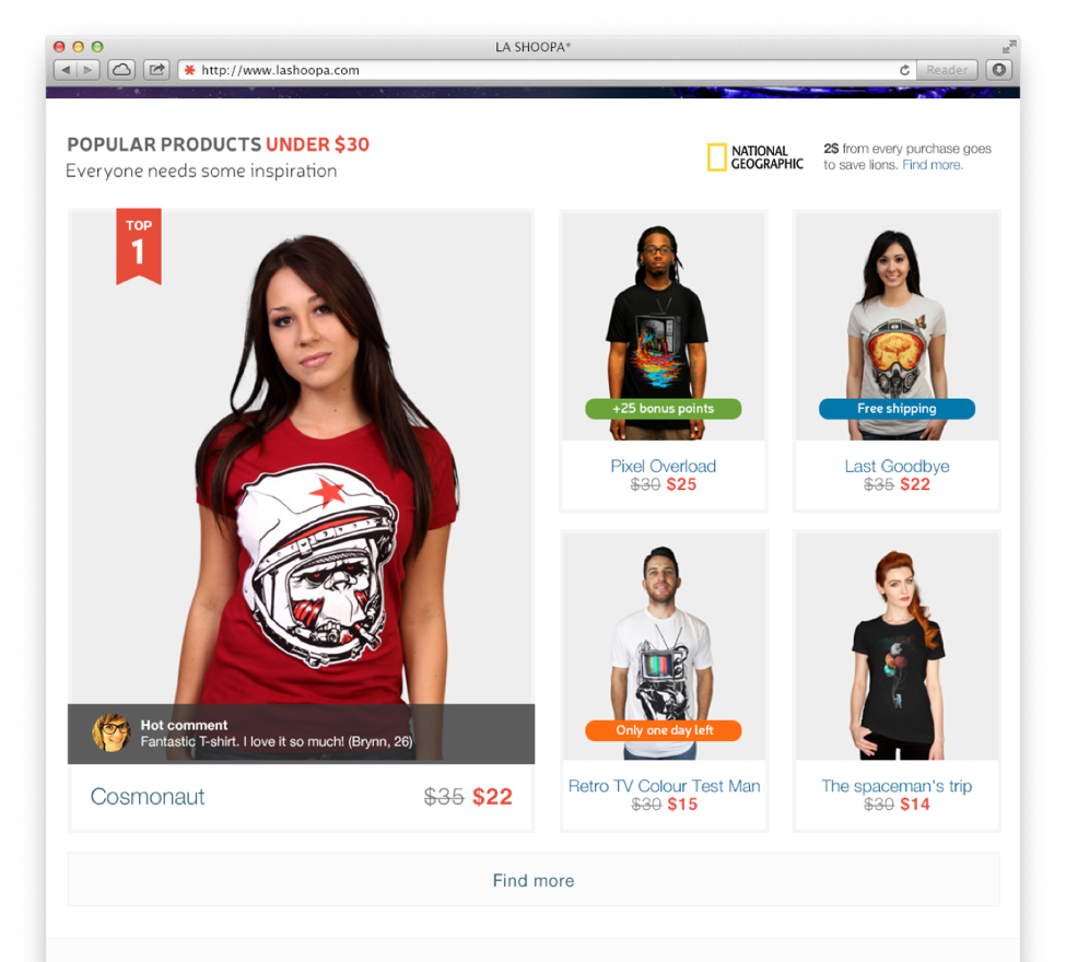
Social learning
We are influenced by others, especially by people like us or people we respect. So let’s use it and add a comment near product.
Peer Advice
As I mentioned before, we trust our friends more than advertising. So we should find a way to persuade customers to advise each other. For these purposes, we can use a recommendation form and promise some discounts.
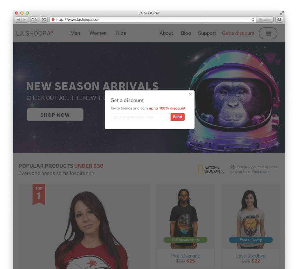
Written Public Statement + Visceral Processing
Written Public Statement. We are very consistent creatures. If you promise something, you will do it. So if we ask people to put something down in writing, they are much more likely to follow through with that later.
Visceral Processing – ”The way our brains automatically respond to stimuli, like bright saturated colours and smooth objects.
For those two principles I added a gift finder form and a bright red banner.
Summary
So in the end, we have almost the same design, but second one certainly persuades you to buy a t-shirt more than the previous one.
And to conclude I’d like to use a quote from user experience design guru Lou Carbone:
“You cannot NOT have an experience so learn how to make it a memorable one.”
The Dark Side
And now the dark side. As mentioned, every tool can be used for both good and bad. By using PET Design™ or any other persuasive design technique you can encourage and slightly nudge users to take action or even trick them into doing things.
Let’s look at a few examples, which show how the same techniques were used for bad.
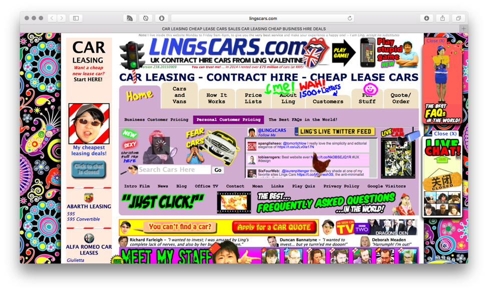
Overuse
Ling’s cars is a perfect example, which shows what will you get if you overuse persuasive design techniques. P.S. They became famous among designers and it seems that it was a particular marketing goal, but I think you’ll agree that it’s horrible.
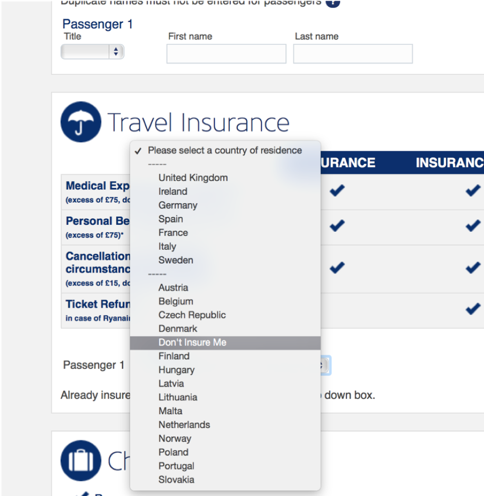
No contrast
With a solid understanding of human psychology and persuasive design techniques Ryanair tricked users into buying insurance.
The power of free things + No Contrast
The power of free things. Badoo offers you free Super Powers (sounds cool, yeah?) to stay with them.
No contrast. “Delete your profile” is not very visible on screen.

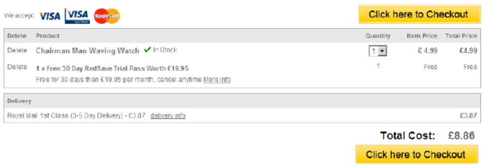
The power of free things + Miscommunication
As you can see “free” RedSave Trial Pass was added without your permission. Even more – the pass is free for only 30 days and then you will be charged automatically.
Real dark side
Some companies went deeper into the dark side. LinkedIn tried to use some dark techniques. The result – the company is going to be paying for it as part of a class-action lawsuit, to the tune of $13 million. The problem with using dark persuasive techniques is so big that some countries decided to regulate them. For example, some dark patterns are now illegal in UK.
Your choice. Would you join the dark side?

Get in touch
Let us offer you a new perspective.