Blog
by by Aleksandr Beliaev, Nortal's Senior Front-End Developer
Lessons learned from going Atomic
Your organization has people filling different roles — designers, developers, analysts — and possessing varying levels of experience working with UI. It is desirable to bring order and transparency to the whole team regarding which design patterns to use.
We already had tools in place allowing people to review the user interface within a project. However, without proper structure and methodology, UI order was quickly turning into chaos, and tasks as simple as finding a specific view or interface element were becoming progressively harder.
The remedy is creating a design system — a tool that codifies existing design patterns in UI, its conventions and practices in a structured way. Ideally started at the beginning of the project, this system is meant to always remain a work in progress, updated continuously as your design evolves. In the case of our eHealth user interface, we hoped to save a lot of time and trouble by giving our design some mutually understandable rules from the outset.
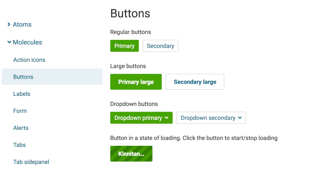
Atomic Design does this by dividing UI entities into atoms, molecules, organisms, templates and pages. Practically speaking, our design system is represented by a style guide that consists of a hierarchical set of pages. Each page showcases a group of atoms, a molecule, or an organism, and contains a description of the pattern, some live examples, and the self-updating Angular code samples that enable them.
Rough spots and recommendations
Fairly soon, we realized that the Atomic Design chemistry-based analogy is a bit artificial. Though it sounds like a natural and straightforward construct, it was something too foreign for most of the developers to comprehend and embrace. On the code level, for example, there was no clear distinction between molecules and organisms, which confused the team. Evidently, we’re not the only ones who’ve encountered this issue.
Beyond that, we also saw that members of our team didn’t have clear definitions of the terms used by the design system, so comprehension and communication suffered. In some cases, people in different roles were using the same words with different meanings.
In the end, we decided that our first version of the design system hadn’t sufficiently met the specific needs and high expectations of all its user groups. We’re still working on improvements, but already have some useful takeaways:
- Keeping the design system organization and vocabulary in sync with the codebase pays off. Though laborious in cases of conceptual changes (you need to rename a lot of stuff in your code!), it ensures that all developers understand the principles it uses.
- It is reasonable to develop your design vocabulary without much regard for existing methodologies, keeping the primary focus on how the team works. Keep things understandable for all parties involved.
- Developing design protocols should be accompanied by introducing new workflows that should function along with the system. It doesn’t make sense to introduce a style guide without involving the people actually working with it.
Clear payoffs
Despite the difficulties, using Atomic Design methodology has already moved us forward, giving us a more transparent look at the distinctive design features of the UI.
Our internal communications have improved considerably. It’s far easier to explain how a component works when you can refer to an example in the style guide. And having a structured style guide is excellent for design consistency because you can easily review the existing color palette, components or their variations, and choose one of the listed patterns instead of adding a new one. And finally, clients like it because it has brought organization into the body of the design work, and thus, made it easier to understand.
Hopefully, by sharing the insights we’ve gained while creating our design system, we can help others skip the difficulties and reach the benefits stage with a little less effort.

Aleksandr Beliaev
Senior UI Developer
Aleksandr Beliaev, Senior UI Developer at Nortal, is an enthusiastic explorer of anything that concerns user interfaces. Backed by considerable experience in digital design and teaching, he’s a strong proponent of usability and accessibility in both UIs and physical environments. Aleksander’s current work focuses on design systems, though he still likes to tinker around with code and push the good old CSS to the limit.


Get in touch
Let us offer you a new perspective.